Vi bruger cookies til at forbedre Bookmate-webstedsoplevelsen og vores anbefalinger.
For at få mere at vide, skal du læse vores cookiepolitik.
For at få mere at vide, skal du læse vores cookiepolitik.
Accepter alle cookies
Cookie-indstillinger
Noget gik galt. Prøv igen.

en
Hent appen:
iOS
·Android
Geri Coady
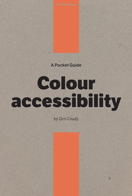
A Pocket Guide to Colour accessibility
Giv mig besked når bogen er tilgængelig
Vurdering
Føj til hylde
Har allerede læst
Rapportér en fejl i denne bog
Del
Facebook
Twitter
Kopier link
Denne bog er ikke tilgængelig i streaming pt. men du kan uploade din egen epub- eller fb2-fil og læse den sammen med dine andre bøger på Bookmate. Hvordan overfører jeg en bog?
- Om
- Læsere4
- På boghylderne
We often take colour for granted when choosing palettes for our designs, assuming the appearance will be the same for everyone.
In reality, the choices that look good to people with good colour vision could cause serious usability problems for people affected by various forms of colour-blindness, a type of disability that affects the perception of colour and occurs in a surprisingly large percentage of the population.
This Pocket Guide will teach you how to create designs that are accessible to people with colour-blindness without sacrificing aesthetics.
Who should read this book?
This book is primarily aimed at web, app and game designers who want to ensure their colour choices are as accessible as possible, but contains useful information that will benefit any designer who makes colour decisions in a project.
Topics include:
PART 1: LEARN ABOUT COLOUR-BLINDNESS
An explanation of what colour-blindness is, what it looks like, how it affects people, and why we should care.
PART 2: CHOOSE APPROPRIATE COLOURS
Strategies for choosing colour combinations that are more likely to be discernible by the largest number of people.
PART 3: TIPS AND TRICKS
What to do and what to avoid when designing with colour.
PART 4: CHECK YOUR WORK
How to catch any potential problems in your work and ensure your websites meet colour contrast compliance.
PART 5: PROVIDE ALTERNATIVES
Ideas for features that can be implemented in existing designs to increase usability.
mere
Denne bog er ikke tilgængelig i øjeblikket
91 trykte sider
Har du allerede læst den? Hvad synes du om den?
👍👎
På boghylderne
fb2epub
Træk og slip dine filer
(ikke mere end 5 ad gangen)

